
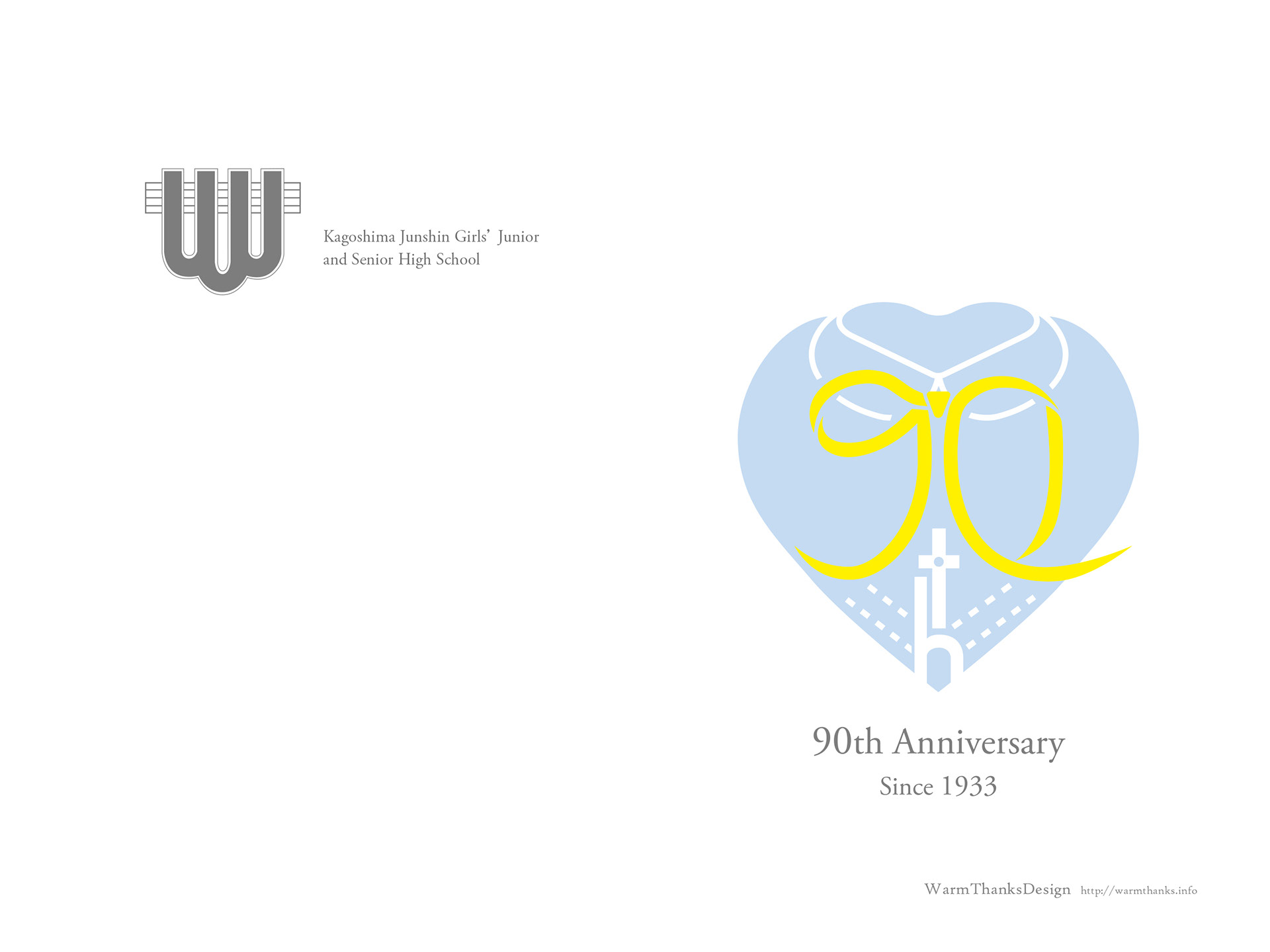
鹿児島純心女子中学校・高等学校の90周年記念ロゴデザインを担当させていただきました。
このプロジェクトは非常に特殊で、最初に生徒たちによる90周年記念ロゴのアイデアを募集し、その中から優勝したデザインを公式のロゴに仕上げるというデザイン案件でした。
I was in charge of designing the 90th-anniversary logo for Kagoshima Jyoshin Women's Junior and Senior High School.
This project was quite unique. Initially, we had the students create illustrations for the 90th-anniversary logo through a contest. The winning design from the contest was then refined and developed into the official logo.
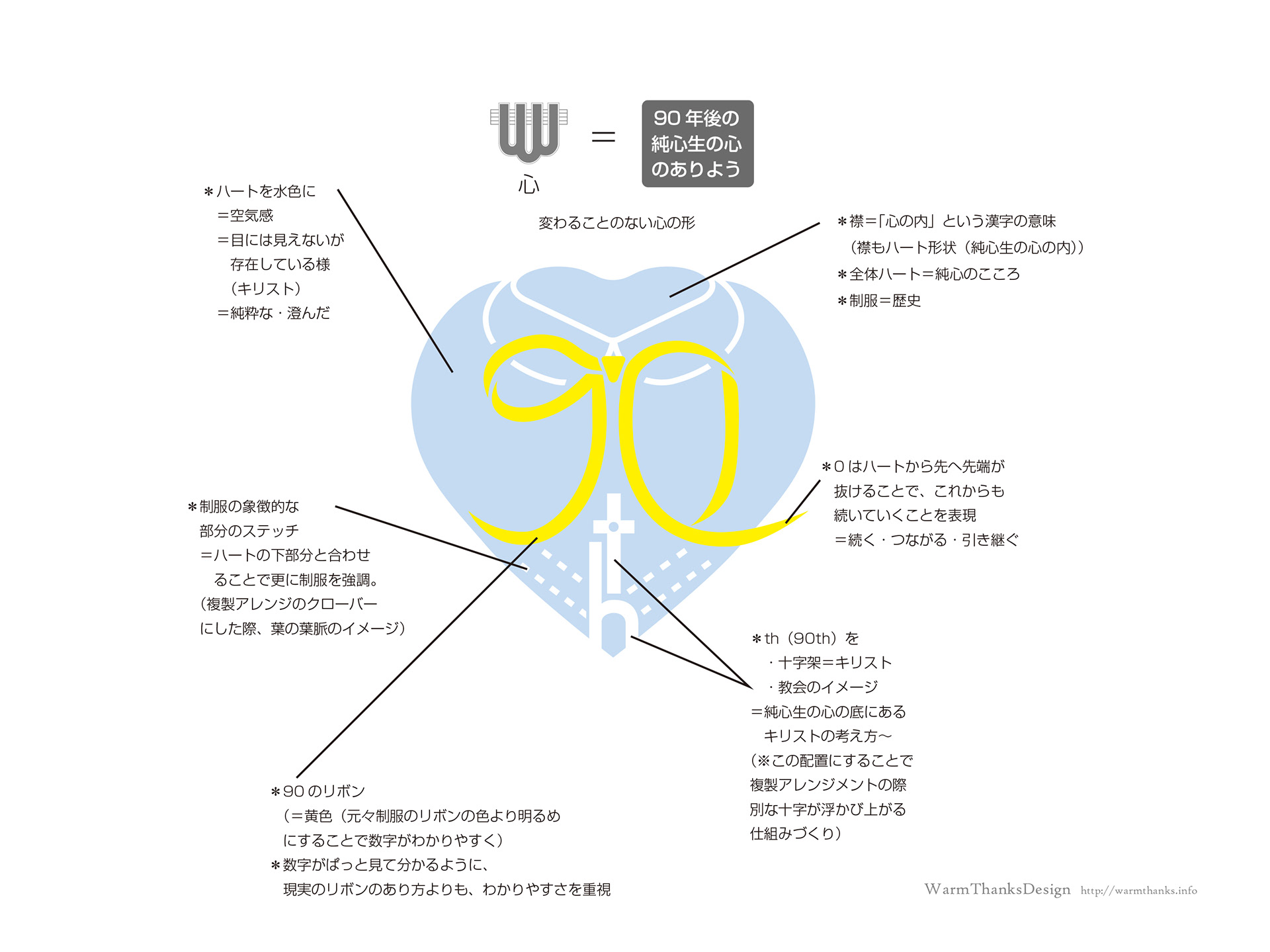
残念ながら元のラフスケッチをお見せできないので、変更点が分かりにくいかもしれませんが、デザインにはハート、制服、そして90のリボンといった要素が含まれています。これらの要素は最初は別々に存在していましたが、私はそれらを一体化させるデザインに仕上げました。
特に、このロゴのテーマは当初、学校からは与えられていませんでしたが、私が設定したテーマは『90年後の純心学生の心の在り方』です。
学校の校章自体が元々『心』という概念を表しており、この『心』をもっと具体的に表現することを目指しました。ロゴが校章と並べられる際に、どんな『心』なのかが明確に伝わるべきだと考えました。
このデザインにおいて特に注意を払った点は、雰囲気の表現、襟部分の意義、内面の感情を表現するためのハートの追加、そして柄を作り上げる仕組み('th'の部分、キリストを象徴し、キリストを表現する柄)です。
I can't show you the original rough draft, so it might be a bit hard to see how it has changed. However, the design retains elements like the heart, the school uniform, and the '90' ribbon. I integrated all these elements into a cohesive design, even though they were originally separate in the rough drafts.
The theme of this logo was not initially defined by the school, but I personally established the theme as 'The State of Mind of Jyoshin Students 90 Years from Now.'
The school's emblem itself originally represents the concept of 'heart,' so I aimed to make this 'heart' more concrete. I wanted to express what kind of 'heart' it is currently. It should be clear what kind of 'heart' it represents, especially when placed alongside the school emblem.
I paid particular attention to conveying a sense of atmosphere, the significance of the collar part, adding a heart to express 'inner feelings,' and creating a pattern (the 'th' part, which signifies Christ and the pattern representing Christ).
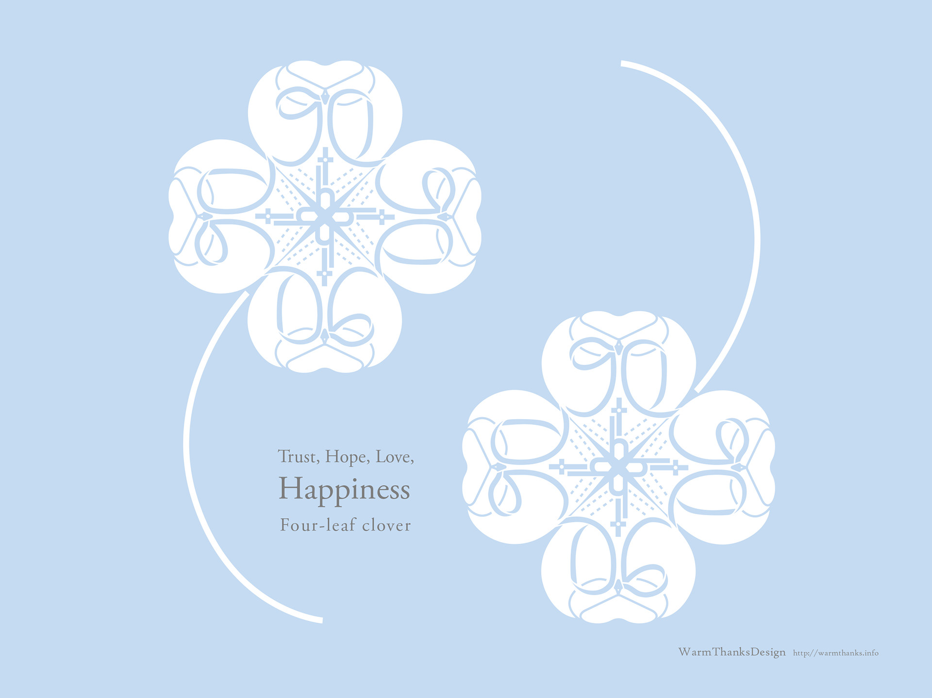
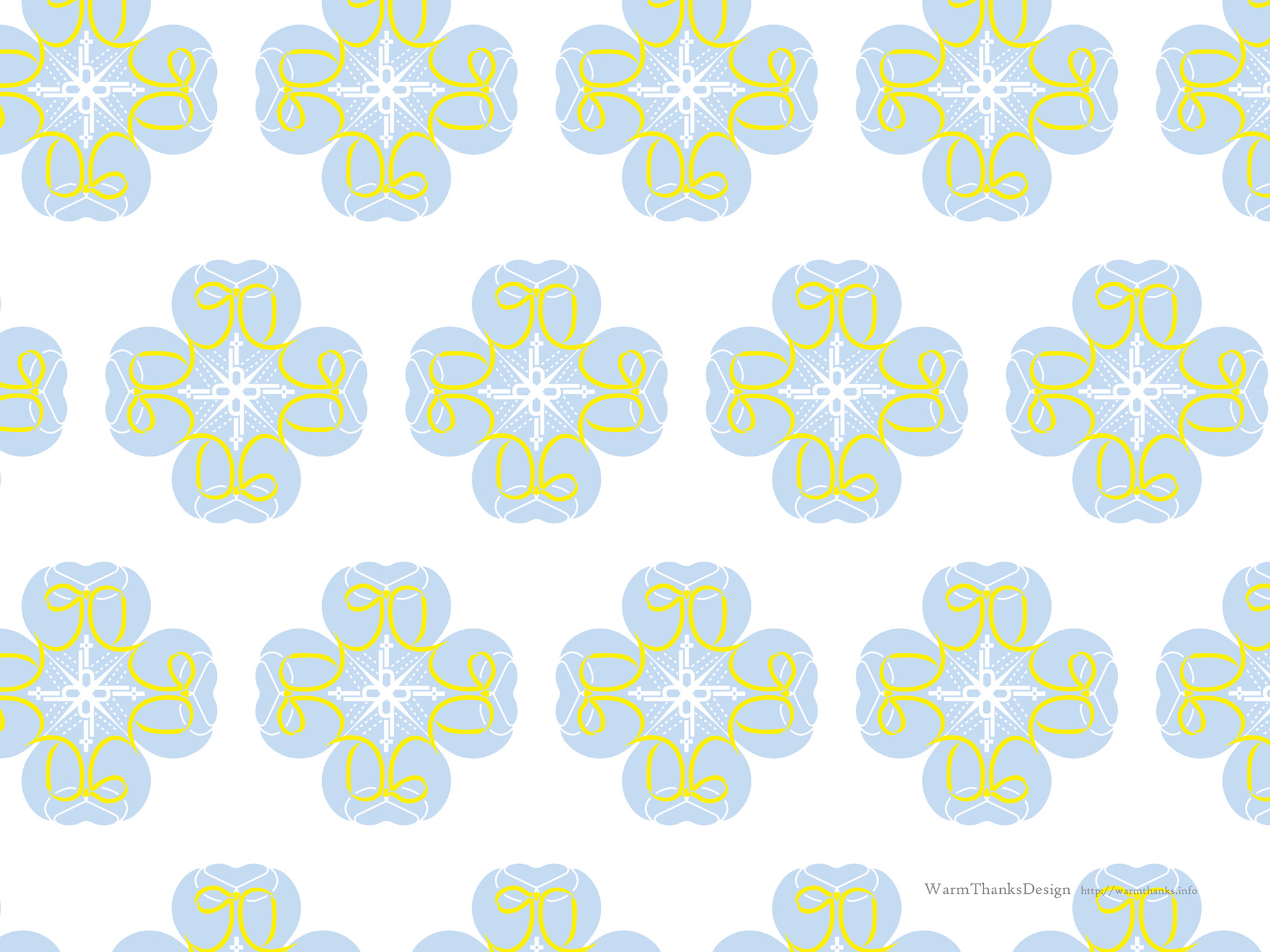
要望の中で、ロゴを使った柄作りという難しい課題がありました。その結果、ロゴを上下左右に配置すると、クローバー柄(四つ葉のクローバー)が形成されます。
実は、四つ葉のクローバーのモチーフはキリスト教と深い関係があります。伝説によれば、修道士である聖パトリックが、シャムロック(三つ葉のクローバー)を使って「信仰、希望、愛」を象徴し、キリスト教の教えを説いたと言われています。その後、珍しい四つ葉のクローバーは「幸運」を意味するものとして認識され、幸せの象徴とされました。
さらに、このロゴの'90th'の「th」の部分に巧妙なデザイン要素が組み込まれています。この部分を上下左右に配置すると、キリスト教の十字架を形成し、キリスト教の十字架を思わせるデザインになっています。制服の点線模様もクローバーの葉脈を連想させ、全体のデザインに貢献しています。
Among the requests, there was a challenging one, which was to create a pattern with the logo. So, when you arrange the logo vertically and horizontally, it forms a clover pattern (a four-leaf clover).
The origin of the motif of the four-leaf clover is actually closely related to Christianity. It is believed that it originated when Saint Patrick, a monk, used the three-leaf clover (shamrock) to symbolize 'faith, hope, and love' while preaching Christian teachings. He then likened the rare four-leaf clover to 'good luck,' and it became a symbol of happiness.
Additionally, a clever design element was incorporated into the '90th' part of the logo. When you flip the 'th' part vertically and horizontally, it forms a cross, resembling the Christian cross. The dotted pattern on the school uniform also resembles the veins of the clover leaves, contributing to the overall design.
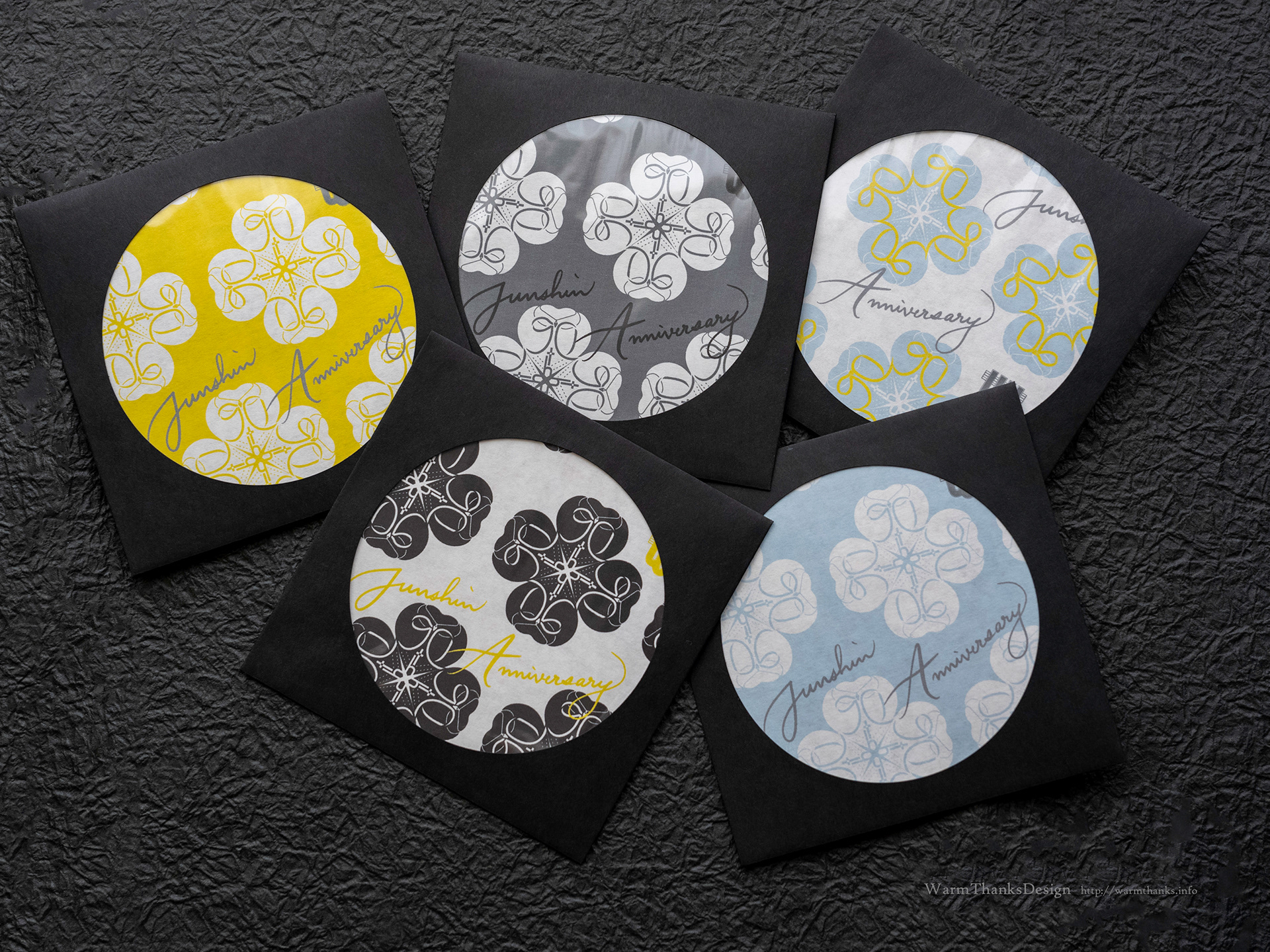
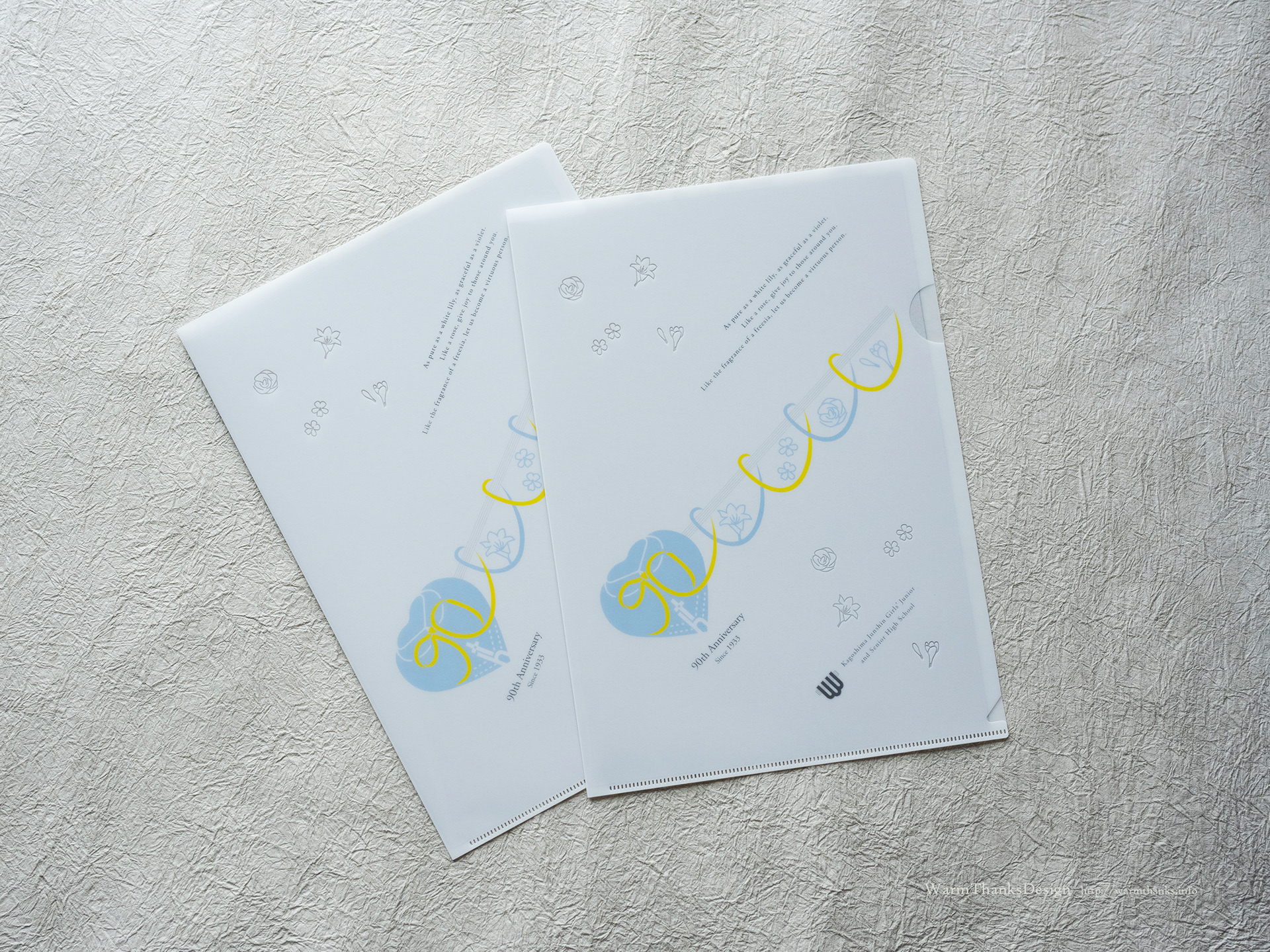
このデザインは、情熱的で感情豊かな作品で、可憐な純白の背景が乙女の無垢さを思わせ、透明な花の香りを伝えます。
このファイルのデザインは、ロゴに組み込まれなかった「魂の受け継ぎ」のイメージを展開しています。花は精神(心)を表し、魂の受け継ぎは精神を伝える儀式です。デザインの中でリボンが流れるように結ぶ様子は、過去から未来へと続く歴史を象徴しています。
リボンの上に五線譜を配置し、リボンの流れと合わせて学校のエンブレムのイラスト化を思わせ、五線譜は音楽の進行(時間の経過)を象徴し、「時間の進行」を意味しています。
時間とともに移り変わる「魂の受け継ぎ」の花々が配置されていますが、各花には独自の意味があります。学生個々が時代とともに成長し変化するように、花々も変化し、つながり、学生が時間を通じて移行していくイメージを伝えます。
要するに、90周年記念ロゴ(心の本質と歴史の変わらない部分)と花々の組み合わせは、生きている存在(個々の学生)と、その構成要素が変化する様子を表しています。
This design is an emotionally evocative piece with a delicate, pure white background that resembles a maiden's innocence and transparently conveys the scent of flowers.
As for the design of this file, it expands upon the 'inherited soul' image that was not incorporated into the logo. In this context, a flower represents the spirit (heart), and the act of inheriting the soul is a ritual of passing on the spirit. The flowing ribbons in the design symbolize the passage of time, connecting the history that has transpired with the history yet to unfold.
By placing staff lines above the ribbons and aligning them with the flow of the ribbons, it brings to mind an illustrated representation of the school emblem. The staff lines symbolize the progression of music (time flowing), signifying 'the passage of time.'
The flowers representing the 'inherited souls' flow with time, and each flower possesses its own unique meaning. Just as individual students evolve with the times, the flowers also change and connect, conveying the imagery of students transitioning through time.
In essence, the combination of the 90th-anniversary logo (the unchanging essence of the heart and history) and the flowers represents the living presence (individual students) and the ever-changing elements in their composition."
(Note: The translation is based on the provided text, and some of the cultural and artistic nuances may be challenging to fully capture in translation.)
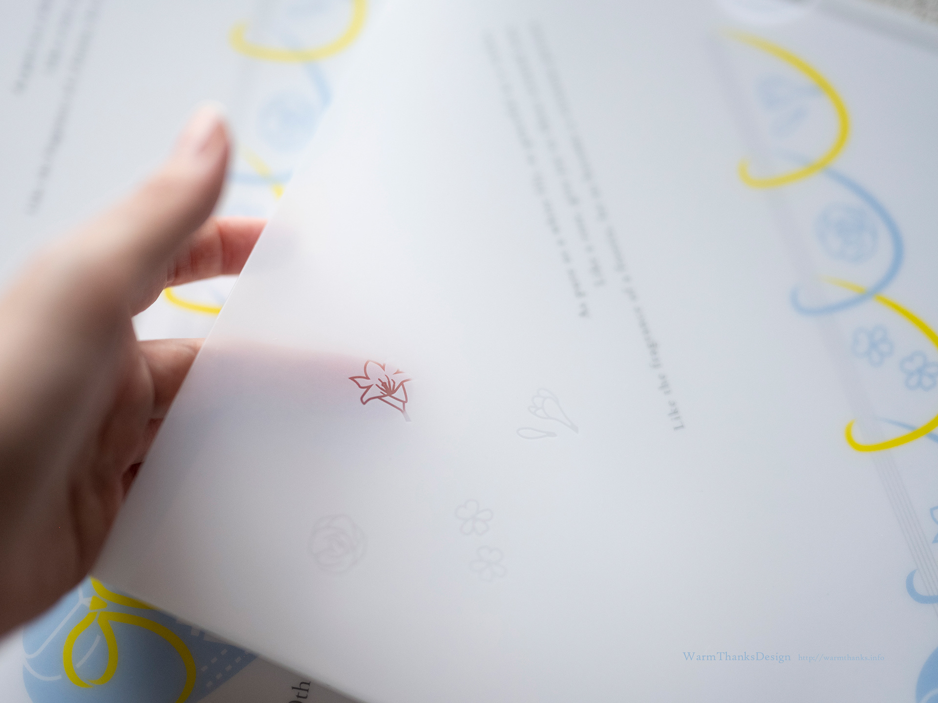
イメージを全体的に右上がりにすることでの動きのあるデザインで、紙面いっぱいに大きめのデザイン展開ができるよう考慮しました。
一工夫として、白背景に対し一部透明表示で花の香りが舞っているような印象になるように、魂ゆずりの花々が飛んでいるように配置。
ちょっとしたことですが、雰囲気のあるファイリングに仕上がっています。
To create a design with movement, I decided to have the overall image slanting upwards to the right, allowing for a large design layout that fills the entire page.
As an extra touch, some of the elements are displayed with partial transparency to create an impression of flower fragrances wafting in the air, resembling the idea of the 'inherited souls' of the flowers flying. It's a subtle detail, but it adds to the atmospheric filing of the design."
**************************
鹿児島純心女子中学校・高等学校HP
The website for Kagoshima Jyoshin Girls' Junior and Senior High School is:
You can visit the website for more information about the school and its activities.
**************************
Design:WarmThanksDesing
Thanks!