
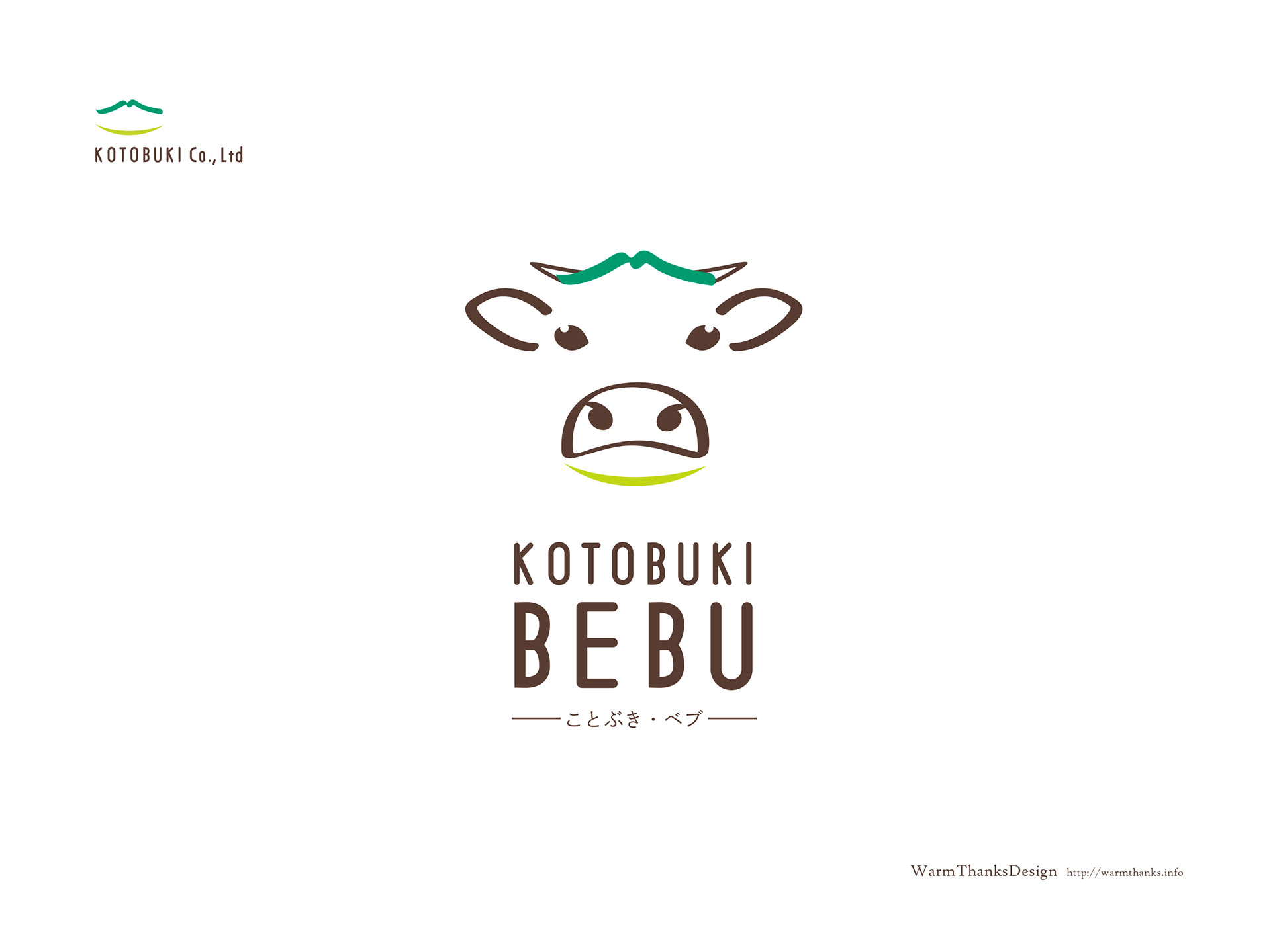
KOTOBUKI BEBUは牛飼料のPB商品として日本で販売されている商品です。
今回はPB商品のVIからデザインしました。
このロゴは商品の販売元である寿商会のロゴマークを用いつつ、
牛ののロゴとしてデザインしています。
また、牛の飼料には三段階の飼料があり、今回は子牛用の飼料と、子牛を産む専門の親牛用の飼料のロゴも作成しています。それぞれの仕分け方は牛が食べている草の種類と色で異なります。
KOTOBUKI BEBU is a product sold in Japan as a PB product for cattle feed.
This time, I designed it from VI of PB product.
This logo uses the logo mark of Kotobuki Co..Ltd, the seller of the product, while using it.
Designed as a cow logo.
This time, I designed it from VI of PB product.
This logo uses the logo mark of Kotobuki Co..Ltd, the seller of the product, while using it.
Designed as a cow logo.
In addition, there are three levels of feed for cattle, and this time we have created a logo for calf feed and feed for parent cows that specialize in producing calves. Each sorting method depends on the type and color of grass that the cow is eating.


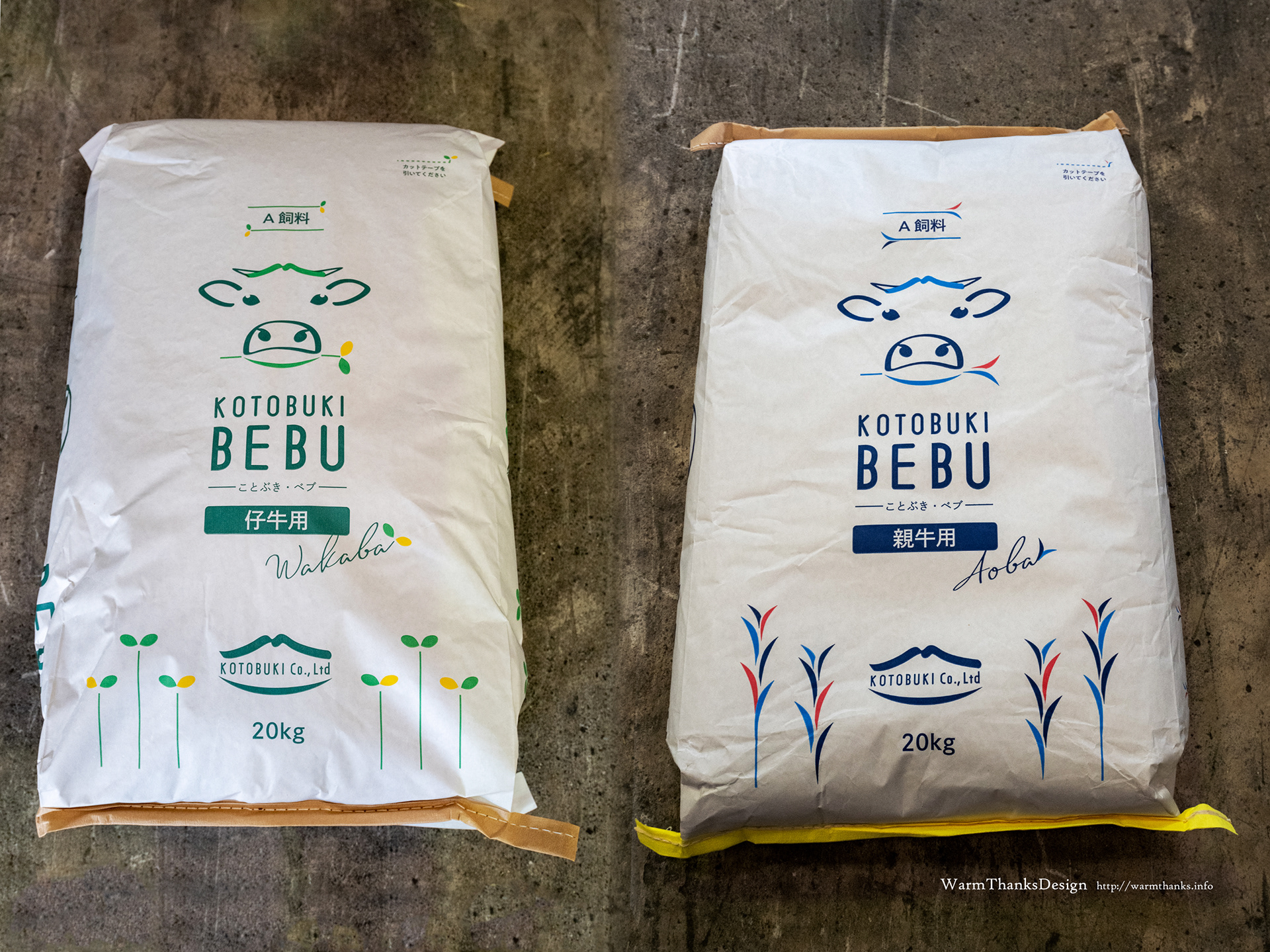
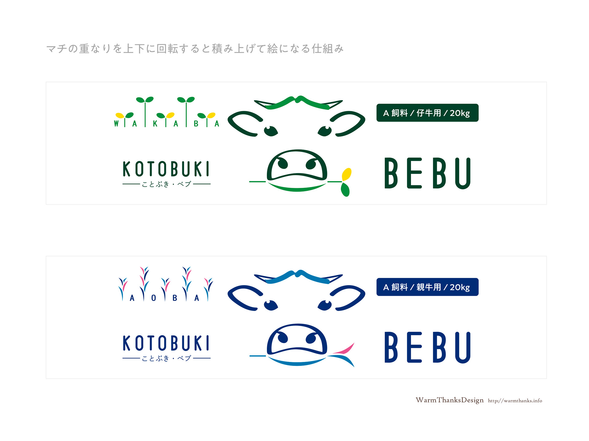
袋のマチにあたる部分には左右それぞれにロゴを分割するように配置しています。
袋を反転させて積み上げた際に、横からでもロゴがわかり、商品がわかるように工夫しています。
The logo is divided into left and right parts on the gusset of the bag.
When the bags are turned upside down and stacked, the logo can be seen from the side so that the product can be seen.
When the bags are turned upside down and stacked, the logo can be seen from the side so that the product can be seen.


寿商会様/牛専用PB飼料 KOTOBUKI BEBU(ことぶきベブ)ブランディング(VI/Naming/PackageDesign YOSHIE TOKUDOME)
KOTOBUKI Co.,Ltd (KANOYA/KAGOSHIMA/JAPAN) https://kotobukishokai.co.jp/
Cattle feed KOTOBUKI BEBU Branding design